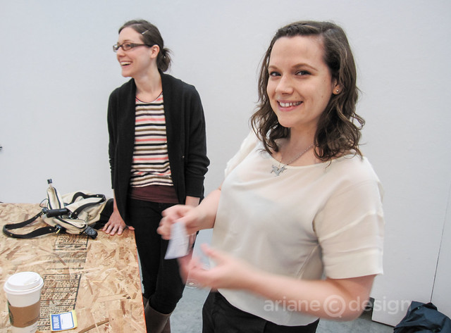
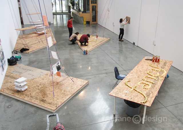
On Saturday, June 23, six participants (with a seventh who dropped in later) enjoyed a Spatial Typography Workshop at Emily Carr University of Art+Design.
Instructor Grace Partridge is a print and publication designer with a strong custom typography background. Her company, Working Format Studio, is a Vancouver-based design studio whose clients include Bon Appétit, for which Working Format recently designed a custom recipe deck.
Grace also teaches book making at Emily Carr. And we’ve something in common: both of us have lived and worked in San Francisco and in The Netherlands before heading to Vancouver to start a design business.
Part of Grace’s enjoyment comes from watching people have fun with letters. “Typography has no limits” was the underlying theme of the entire day, filled with exploring different ways to create letters and typography using non traditional materials.
Why do letterforms have the shapes that they do? This goes back to the hammer and chisel period, where these tools would form a serif, for example. The tools available at the time would dictate a letter’s form.
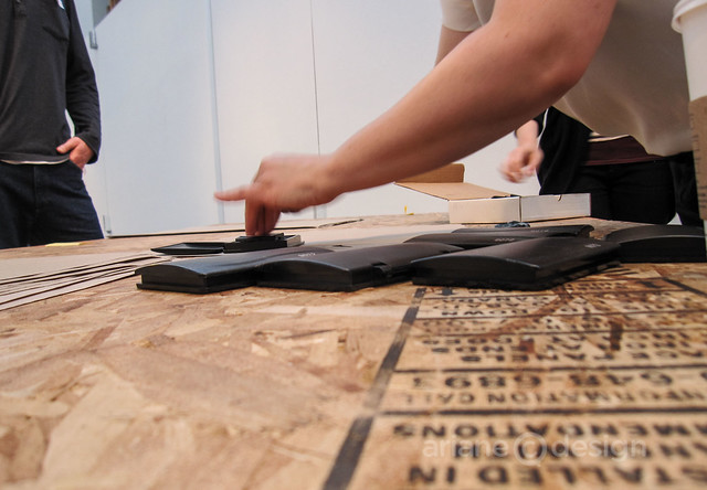
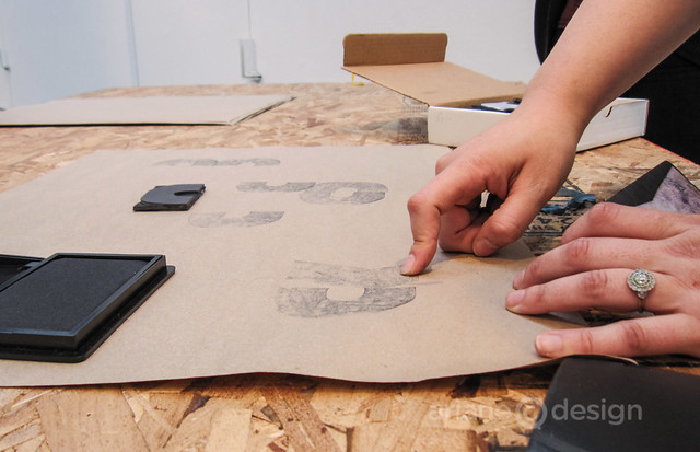
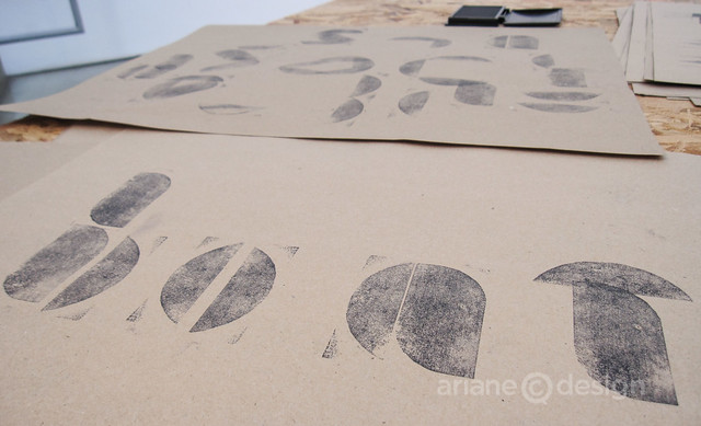
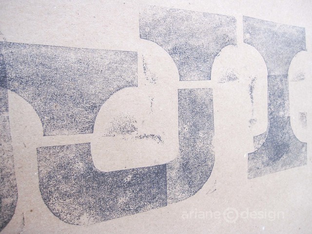
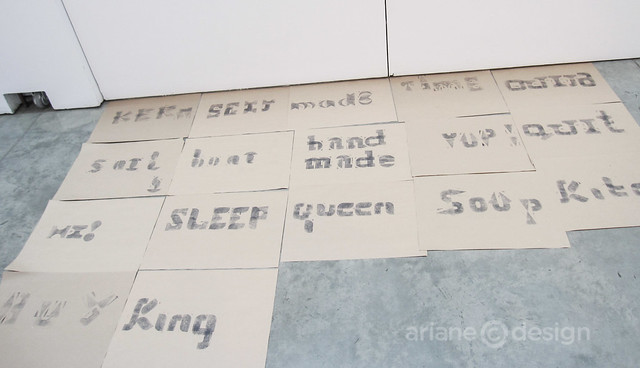
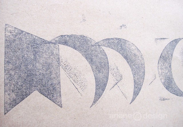
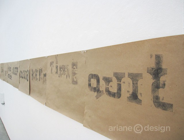
We started the day with a “warm up” exercise, using homemade stamps, each with a unique organic shape. We were left to create our own letterforms simply by inking the stamp onto kraft paper.
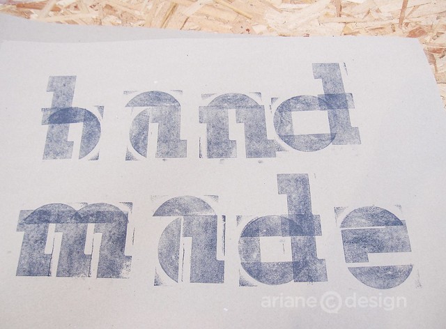
Once we were comfortable with our chosen stamp and the different letters that it could create, we teamed up in pairs, finding ways of creating letters by collaboration (each letter taking on both stamp forms). This culminated in creating entire words. Zach Bulick (a designer at Union Gospel Mission) and I created the word “handmade” together.
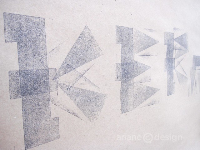
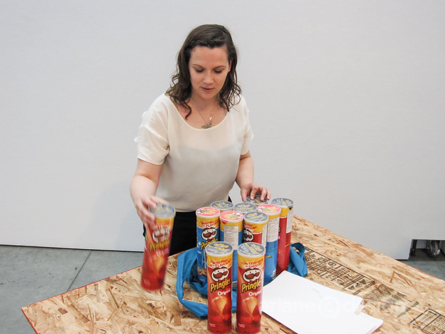
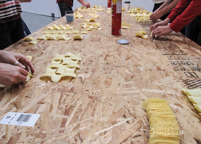
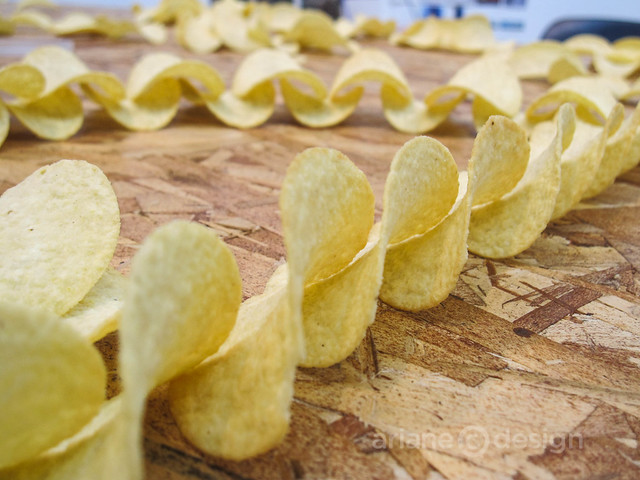
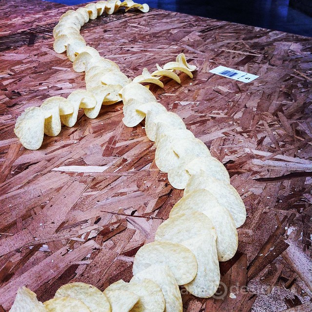
After lunch hour (spent exploring nearby Granville Island Public Market with its numerous food options), we were given a new challenge: to create forms using Pringles potato chips.
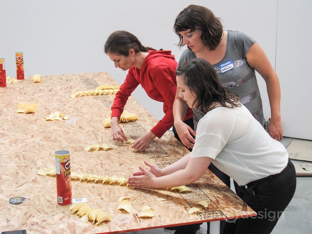
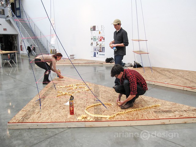
Our creative juices were left to explore how repeating patterns with the chips could be used to create an entire letter, and later, a word. Our group was joined by a Brazilian woman on vacation in Vancouver. Although she had very limited English speaking skills, she understood the universal language of creation and was every bit as productive as the rest of the group.
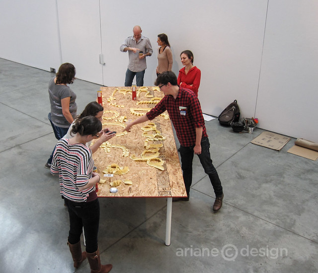
We were then split into two teams to go off and create an installation piece, one on a work table, the other on a surface in the Concourse Gallery.
This was a very enjoyable way to engage and think of letterforms “outside the box”. Away from the ease and convenience of a computer to create instant typography, these simple methods led to a wonderful rhythm of work and exploration. This workshop was the final offering in Design Every Day.
Design Every Day, a one-month design institute at Emily Carr University of Art+Design, is an open call for typographers, designers, architects, urbanists and artists to reimagine everyday encounters with letterforms, imagery, objects and spaces, and to reconsider the processes and products of design.
A selection of both free courses and fee-based one day workshops was offered this month through the University’s Continuing Studies Program.
