Here’s the concluding chapter in my Design Symposium series. Earlier chapters include Part One, Part Two, and Part Three. While living in The Netherlands, I devised a design symposium that I presented to first-year students at Delft University of Technology’s Media & Knowledge Engineering program.
I rounded out my talk with a history of typography, followed by various design tips.
The Evolution of Type
BC 3,100 | Early Sumerian pictographs discovered
2,500 | Start of early Cuneiform writing
1,000 | Early Greek alphabet
190 | Parchment is in use for manuscripts
105 | Ts’ai Lun invents paper
AD 868 | Earliest printed manuscript appears
1400 | Gutenberg perfects typographic printing
1467 | Roman-style type
circa 1530 | Garamond establishes type foundry
circa 1600 | English and German newspapers founded
1737 | Fournier Le Jeune standardizes type sizes
1750’s | Industrial Revolution brings several new typefaces onto the scene
1886 | The Linotype Machine
1928 | American modernist typography
1970 | International Typographic style becomes dominant throughout the world
1981 | IBM
1984 | Macintosh
Typeface vs. Font
A typeface is the design of characters unified by consistent visual properties.
A font is a complete set of characters in any one design, size, shape or style of type.
Design Food for Thought
Once you’ve started the brainstorming process, make sure to sketch your ideas onto paper before translating them to the screen. It’s far too easy to fire up Adobe Illustrator and design in there. Pen and paper is quicker and allows more creative freedom.
Try to create an entire page of sketches, large enough to easily explore at a later design stage. Once they’re on paper, you’ve got the freedom to revise and fine-tune the ideas to your liking.
Once you have enough ideas on paper to be able to isolate a few of the stronger ones (usually one of the first to hit the page), develop those into more concrete designs. Now is the time to experiment – BEFORE turning on the computer.
A design needs an organized structure, otherwise it will become impossible to interpret and understand.
A clear visual structure ties all elements of the design together. The elements then work together towards a common communication goal. The design should be readable, its design following a well-thought out grid that clearly presents the concept to the appropriate target.
Strive for good visual structure. The visual elements should be readable according to the most important element for the eye to scan, leading down to the smaller and less important items. I highly recommend creating variations of your principal designs, whether in size, elements, fonts or colour.
If working in Photoshop, try to create several layers within the same document which can be easily clicked on and off, to get an idea of how the variations will affect the design.
A good approach is to print out the initial designs on a black and white printer. This will allow the design’s basic structure to stand out. Pin up the designs onto a wall. View them from a distance rather than close-up on a table. Ask yourself:
– How does the white space compete with the printed area?
– Can the concept and message come clearly across or hidden behind a complexity of elements?
– What is the target audience?
Print vs. Online Design
A big difference between print and interactive design is the way in which the design will be viewed. With print, you must choose colour with regard to paper quality. For example, matte and gloss papers create different types of colour effects in both their saturation and density.
There are numerous colour swatch books on the market that will simulate your design’s colours onto various paper types. Pantone color guides contain various print scenarios, based on paper type, percentage of black ink used, color tints, etc.
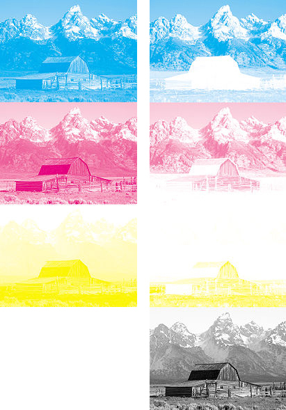
L: Image separated for printing with process cyan, magenta, and yellow inks.
R: The same image, separated with maximum black, to minimize ink use.
Remember that screen design is based on the RGB model, while print works on a CMYK basis. Many people make this error in translating printed pieces to the web, and vice-versa. Red, green, and blue are the “additive colors”. Combining red, green, and blue light creates white. Cyan, magenta, and yellow are “subtractive colors”. These three colours when printed absorb all of the light. As a result, your eye receives no reflected light from the paper and perceives black, in theory.
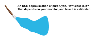
And finally, there are also colours reproducible with CMYK inks which are impossible to represent on a computer screen, such as cyan.

