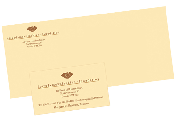
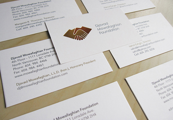
Djavad Mowafaghian Foundation came to our studio looking for a refreshed logo design and business cards. The logo was long due for an overhaul, to be applied across their brand.
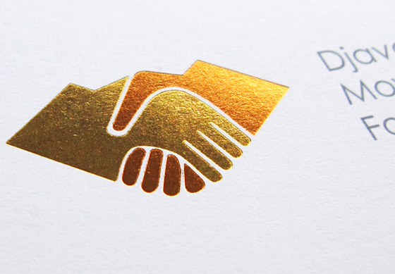
The office way-finding includes a gold and copper version of the interweaving hands, so the challenge was to create a logo that would match their space as well as incorporate a modern approach to the printed material.
Background
For over 30 years, founder Djavad Mowafaghian has both funded various philanthropic projects and donated to various children’s charities worldwide. In 2003, the Djavad Mowafaghian Foundation was set up in order to guarantee the continuation of his philanthropy. The foundation, based in North Vancouver, aids children around the world through health and education.
Process
Avenir (a sans serif font that I often use in my work) came to the rescue, allowing several lines of clean information to be easily stacked on the back side of the card. The logo’s original form was used, with a two-colour foil stamp printing process on a clean off-white paper stock.
Result
The resulting series of cards are now in use and a stationery package is on the way. The client was very happy with the design solution and their current clients will recognize the familiar hands, while new clients will be drawn in by the modern, approachable design.
